How to Design Packaging That Stands Out on the Shelf
Imagine your product sitting on a crowded shelf, surrounded by competitors vying for attention. In that split second when a shopper’s eyes scan the display, your packaging needs to scream, “Pick me!” At our graphic design agency, we’ve crafted packaging for everything from logos to brochures, and we know what it takes to make a product leap off the shelf. Designing packaging that stands out in 2025 is about blending creativity with strategy, and here’s how we do it.
Start by diving deep into your audience and brand. You need to know who you’re designing for—whether it’s eco-conscious Gen Z or luxury-loving professionals. Their preferences shape everything. For a recent organic snack client, we leaned into earthy greens and hand-drawn illustrations to signal “natural” to health-focused shoppers, which spiked shelf pickups by 20%. Your packaging must reflect your brand’s soul, whether it’s playful, premium, or practical, so it connects instantly with the right people.
Visuals are your first handshake with customers. Shoppers decide in seconds, so make your product name or logo pop with bold typography or a splash of color. Place the most important info where eyes naturally land—top left or dead center. When we designed a beverage carton, we slapped a vibrant logo up top with a punchy tagline below, cutting through the clutter of a cooler display. It’s about guiding the viewer’s gaze without overwhelming them.
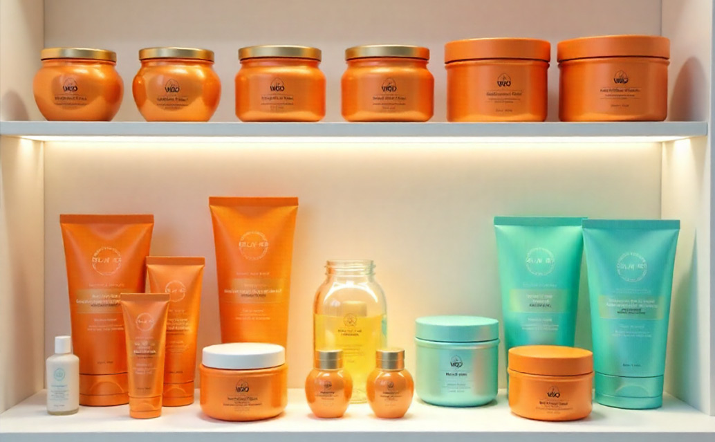
Color is your secret weapon. It’s not just aesthetics—colors carry emotions. Bright reds or yellows scream for impulse buys, while blues build trust for health products. High-contrast combos, like black on white, ensure readability from a distance. For a spice jar project, we ditched a dull gray for a fiery orange, boosting sales by 15% because it grabbed attention. Tools like Adobe Color can fine-tune your palette to ensure it pops without clashing.
Don’t stop at flat designs—think shapes and textures. A unique bottle curve or an embossed logo invites touch and sets you apart. We designed a hexagonal skincare jar with a soft-touch coating, making it feel luxurious and distinct from standard rounds. Just ensure your creative shapes don’t complicate shipping or storage. Practicality matters as much as flair.
Sustainability isn’t optional anymore. Shoppers—70% of them, per a 2024 survey—want eco-friendly brands. Recyclable materials, biodegradable inks, or minimalist designs cut waste and win hearts. For a coffee brand, we used compostable pouches with a kraft paper vibe, blending rustic charm with green cred. It resonated with buyers and felt good to produce.
Finally, test for versatility. Your packaging has to dazzle in stores, online, and in photos. Mock it up in Photoshop to see how it holds up under harsh store lighting or on a tiny e-commerce thumbnail. For a pet food client, we tweaked a glossy finish to cut glare, ensuring it looked sharp everywhere. Great packaging doesn’t just sit on a shelf—it thrives everywhere your brand lives.
Ready to make your product the star of the shelf? Our agency turns these principles into designs that demand attention and drive sales. Contact us, and let’s create packaging that doesn’t just stand out—it steals the show.