The Psychology of Color in Logo Design: How to Choose the Perfect Palette
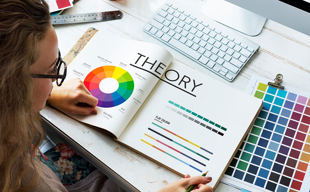
Color isn’t just a visual element—it’s a silent language that speaks to emotions, shapes perceptions, and defines brand identity. At our graphic design agency, we’ve seen firsthand how the right color palette can transform a logo from forgettable to iconic. Understanding the psychology of color is key to crafting logos that resonate with audiences and stand the test of time. Here’s how to choose the perfect palette for your next logo design.
Why Color Matters in Logo Design
Colors evoke emotions and associations that influence how people perceive a brand. A 2023 study found that 80% of consumers believe color increases brand recognition. Think of Coca-Cola’s vibrant red or Tiffany’s calming teal—these hues aren’t random; they’re strategic choices that align with the brand’s personality. Whether you’re designing a bold logo for a startup or a sleek emblem for a luxury brand, color sets the tone.
The Emotional Impact of Colors
Each color carries distinct psychological weight:
Red: Exudes energy, passion, and urgency. Ideal for brands like Netflix, which aim to excite and engage.
Blue: Conveys trust, reliability, and calm. It’s no surprise tech giants like IBM and Facebook lean on blue to inspire confidence.
Yellow: Radiates optimism and creativity, perfect for brands like McDonald’s that want to feel approachable and fun.
Green: Suggests growth, health, and sustainability, as seen in Starbucks’ earthy logo.
Purple: Evokes luxury and creativity, often used by brands like Cadbury to feel premium yet imaginative.
Black and White: Timeless and sophisticated, think Nike or Chanel, where simplicity speaks volumes.
Understanding your client’s target audience is crucial. A youthful, energetic brand might thrive with bold oranges, while a financial firm may prefer muted blues for trustworthiness.
Choosing the Perfect Palette
Define the Brand’s Personality: Start by asking, “What does this brand stand for?” A fitness brand might use fiery reds to inspire action, while a wellness brand could opt for soothing greens.
Consider Cultural Context: Colors carry different meanings across cultures. For example, white symbolizes purity in Western cultures but is associated with mourning in some Asian cultures. Research your audience’s cultural background.
Balance Boldness and Versatility: A logo must work across mediums—business cards, websites, or billboards. Test your palette for contrast and scalability. Tools like Adobe Color can help ensure accessibility.
Limit Your Palette: Stick to 1-3 colors to avoid visual clutter. Monochromatic or analogous schemes (colors next to each other on the wheel) create harmony, while complementary colors (opposites) add vibrancy.
Test Emotional Impact: Show your palette to focus groups or stakeholders. Does it evoke the intended feeling? Adjust based on feedback.
Our Approach
At our agency, we blend psychology with creativity. For a recent tech startup client, we chose a blue-orange palette to balance trust with innovation, resulting in a logo that boosted their brand recall by 30%. Let’s craft a palette that makes your logo unforgettable. Contact us today!